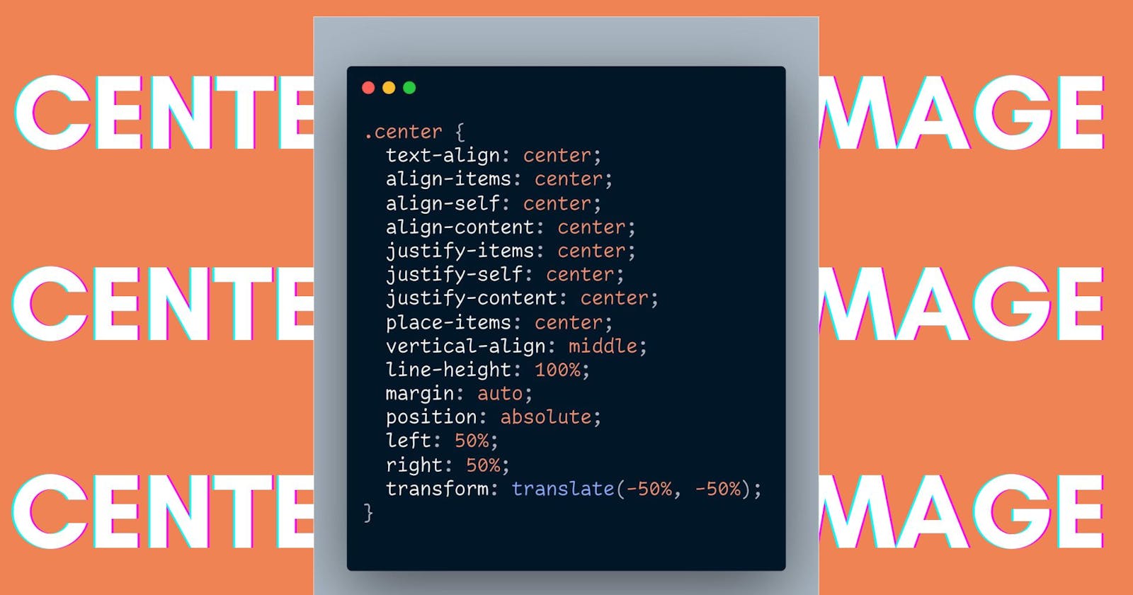
Aligning images according to the content is very important. It brings attention and interest to the reader. And one thing you see often in centering an image. Images are inline-block elements means they stay inline like text but also have some width and height like block elements.
Inline block vs block elements
Block elements are those elements that take the entire space available in terms of width and behave as separate elements.
On the other hand, inline-block are those elements that fit within other HTML tags.
For Example – the <p> tag takes the whole space but the <span> tag takes only the required space.
You can check the difference between <p> and <span> here.
Just like the <span> tag <img> it also behaves as an inline-block. But sometimes people confuse it with a block element. So, I guess it’s enough to let’s get to ways to center an image.
5 ways to center an image
1. Text-align Property
Yes, you read it right text-align !!! Well as we know <img> tag works as an inline block so we can apply some properties to it too.
So, what happened here is
Created a div then gave class ‘container’
Then insert an image using <img> tag.
In CSS, give a fixed width and height
And finally, apply
text-align: center;in the ‘container’ class.
.container {
text-align: center;
}
The codepen below shows this property in action. Check it out and feel free to make any edits.
2. The second method uses the ‘margin’ property.
Now in this approach, we are targeting specifically image. And the process we are going to follow is this.
Just as in the previous example, we will keep our HTML the same
Now this time, we will give styling directly to the image.
Using
display: block;to make the image behave like a block element.Adding margin from left and right.
.container img{
  display: block;
  margin-left: auto;
  margin-right: auto;
}
3. The classic one – ‘position’ property
Now, in this method, the approach is related to position property and translation.
The approach that is taken here is, applying for
position: absoluteon ‘div’ that contains the ‘image’.This will bring the image to the top of its parent element, which in this case is ‘div’.
Then give a 50% margin from the top and left.
Then applying translate (-50%, 50%) will bring the image to the center.
The advantage of this method is it centers the image vertically and horizontally.
.container {
  position: absolute;
  top: 50%;
  left: 50%;
  transform: translate(-50%, -50%)
}
4. Flexbox method
Flexbox gives us reasonable control over how to align items respective to the parent element. You can find out in more detail here.
For now, let’s understand the process
We applied flexbox using
display: flex;Then we will use ‘align-items’ to align items vertically, Here
align-items: centerAnd then ‘justify content’ to align items horizontally, Here it will look like
justify-content: center;
.container {
  height: 100%;
  display: flex;
  align-items: center;
  justify-content: center;
}
5. Final method using CSS Grid
Grid follows the concept of seeing web pages in form of frames or grids. To know more check this guide out.
The process that we are following here is
Applying ‘grid’ on the parent element of the image, by using
display: grid;Then place content property to center the image.
Grid is smart enough to see the webpage in a grid format and take decisions according to it.
.container {
  display: grid;
  place-content: center;
  height: 100%;
}
Conclusion
In this article, we learned about centering an image
Using text-align property but It applies horizontally, and if other elements are added in the same <div> then it was cause difficulties
Making our image behave like block elements using
display: blockproperty.
But again it also aligns horizontally.The third one was using position: absolute and translate. It aligns both vertically and horizontally.
The fourth one was using flexbox, where we align in two parts initially horizontally and then vertically using
justify-content: center.And the last one was using Grid which divides the page into sections or grids and places images in the center using
place-items: center
I hope after reading this you will get your images in the best layouts possible.
